Call-to-Action Buttons: Placement, Color and Copy That Works

Every page on your website has one job that matters more than all the others: moving the visitor to take the next step. That step almost always runs through call-to-action buttons — call now, get a quote, book an appointment. Yet most small business websites treat their buttons as an afterthought: small, timid, vague, and easy to miss. A well-designed call to action is a small change with an outsized payoff. Here is how to get placement, color, and copy right.
Write Buttons That Promise Something
The words on your button matter enormously. "Submit" promises nothing — it describes what happens to the form, not what the visitor gets. "Get My Free Quote" promises something valuable. The best button copy is specific, benefit-focused, and written from the visitor's point of view.
Compare these pairs: "Submit" versus "Send My Request." "Click Here" versus "See Available Times." "Learn More" versus "See How It Works." In each case, the second option tells the visitor what happens next and why it is worth their click. Use first-person phrasing ("Get My," "Book My") where it feels natural — it consistently outperforms generic commands because it puts the visitor in the picture.
Choose a Color That Pops
Your primary button should be the most visually striking element on the page — the thing the eye finds first. That means choosing a color that contrasts strongly with your site's dominant colors. On a blue-and-white website, an orange button stands out beautifully. On a site with warm earth tones, a deep green or bold blue does the job.
The specific color matters less than the contrast and consistency. Pick one primary button color and use it for your main action on every page, so visitors learn what "the important button" looks like. Use a quieter, secondary button style — an outline or a muted shade — for secondary actions like "Learn More," so the primary action always wins the visual competition. Weak buttons are among the top website design mistakes that kill conversions.
Put It Where Eyes Already Go
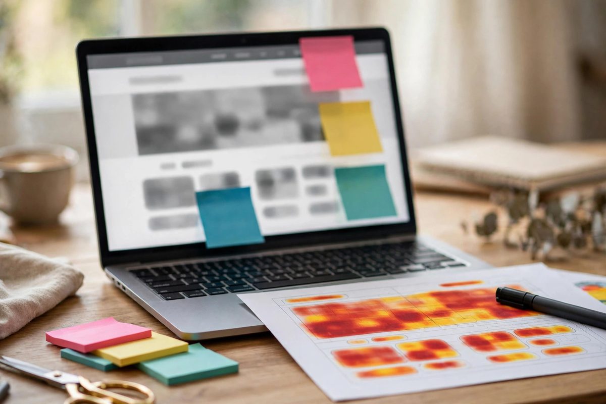
Placement is the third pillar. Your primary call to action belongs in the top section of every page, visible without scrolling — the above-the-fold area is prime real estate. It also belongs in your header or navigation, so it follows visitors wherever they go. And it should reappear after each major section — after your services, after your testimonials, after your pricing — because you never know which section will convince a particular visitor.
On mobile, consider a sticky call button fixed to the bottom of the screen — typically "Call Now" for service businesses. Mobile visitors are often ready to act immediately, and a thumb-friendly button that is always within reach removes the last bit of friction between interest and contact. This is one of the most effective ways to turn visitors into phone calls.
Size It Like It Matters
Buttons that are too small get ignored; buttons that are generously sized get clicked. Your primary buttons should have comfortable padding — large enough to tap easily with a thumb on a phone, which generally means at least 44 pixels tall. Give them breathing room too: a button crammed between paragraphs is easy to overlook, while one with white space around it commands attention.
Avoid placing competing buttons side by side with equal visual weight. If "Get a Quote" and "Read Our Blog" look identical, visitors may choose the lower-commitment option. Make the action you want unmistakably the star.
Reduce the Fear of Clicking
Even a perfect button fails if clicking it feels risky. Visitors hesitate when they are unsure what happens next, whether they will be charged, or whether they will be trapped in a sales call. Small reassurances near your button dissolve that hesitation: "Free, no obligation," "Takes 30 seconds," "No credit card required."
This is especially important on forms. A button that says "Get My Free Estimate" next to microcopy reading "We reply within one business day — no spam, ever" will convert far better than the same button floating alone. You are not just asking for a click; you are answering the unspoken question, "what happens if I do?"
Call-to-Action Buttons Checklist
- →Copy promises a specific benefit: "Get My Free Quote," not "Submit."
- →Color contrasts strongly with the page and is used consistently for the primary action.
- →Visible above the fold, in the header, and repeated after each major section.
- →Large enough to tap comfortably on a phone, with white space around it.
- →Reassuring microcopy nearby removes fear: free, fast, no obligation.
- →Secondary actions use a quieter style so the primary button always stands out.
Frequently Asked Questions
What are the best words for a call-to-action button?
Specific, benefit-driven phrases like "Get My Free Quote" or "Book My Appointment." Avoid vague words like "Submit" or "Click Here" — they promise nothing.
What color should my CTA button be?
One that contrasts strongly with your page's dominant colors and is used consistently for your primary action everywhere. Contrast matters more than the specific hue.
How many call-to-action buttons should a page have?
Repeat one primary action throughout the page — top, after each major section, and at the bottom. Multiple different competing actions dilute focus.
Do sticky mobile call buttons really work?
Yes, especially "Call Now" buttons for service businesses. Mobile visitors often want to act immediately, and a fixed thumb-friendly button removes the final friction.
Your call to action is where browsing turns into business. Treat it as the most important design decision on the page — because it is. Get the words, color, placement, and reassurance right, and you will be surprised how many more visitors take the next step. If you want a professional review of your site's conversion points, a design consultation can pinpoint exactly where visitors are dropping off.

Muhammad Usman designs and builds high-converting websites for small businesses — and writes practical guides like this one from real project experience.
Keep Reading

How to Design a Website That Looks Expensive on a Budget
How Many Pages Should a Small Business Website Have?

White Space in Web Design: Why Less Is More
Need a Website That Actually Performs?
Fixed pricing, professional build, live in weeks. Tell us about your project — free strategy call, no pressure.