Dark Mode vs Light Mode: What Converts Better?
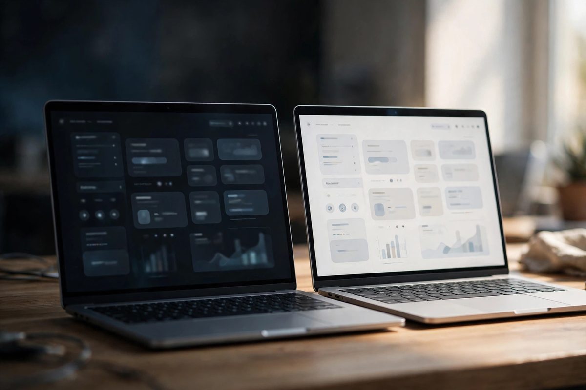
Dark mode vs light mode is one of the most debated questions in modern web design. Dark interfaces look sleek and contemporary; light interfaces feel classic and safe. But for a small business website, looks are not the real question — conversions are. Does your choice of mode actually affect whether visitors call, book, or buy? The answer is more nuanced than most designers admit. Here is an honest comparison to help you decide.
The Case for Light Mode
Light mode — dark text on a light background — remains the default for business websites, and for good reasons. Decades of reading habits have trained people to associate light backgrounds with documents, books, and trustworthy information. For text-heavy pages like service descriptions, pricing, and blog articles, light mode generally offers superior readability, especially in bright environments like outdoors or sunlit offices.
Light mode also photographs well in the contexts that matter: screenshots shared in proposals, printed pages, and accessibility tools. For most small businesses — plumbers, dentists, law firms, restaurants — light mode is the safer choice because it matches visitor expectations. When in doubt, familiarity converts.
The Case for Dark Mode
Dark mode excels at atmosphere. It makes images and videos pop, gives interfaces a premium tech feel, and reduces eye strain in low-light environments — which is when many people browse on their phones. Creative agencies, SaaS products, entertainment brands, and nightlife businesses often benefit from dark mode's modern edge.
Dark backgrounds also make colored accents glow: a bright orange button on near-black is visually electric in a way no light-mode equivalent can match. If your brand skews young, tech-forward, or premium-creative, dark mode can differentiate you memorably. Just be aware it demands more design skill — poor contrast in dark mode is unforgiving.
What Actually Affects Conversions
Here is the uncomfortable truth: there is no universal winner. What converts is not the mode itself but how well it is executed. A well-designed light site beats a sloppy dark site, and vice versa. The factors that actually move the needle are readability, contrast, and consistency within whichever mode you choose.
- →Contrast ratios: body text must be easily readable in your chosen mode — pure white on pure black can cause halation; use off-black backgrounds and slightly softened white text.
- →Button visibility: your call to action must pop in the mode you chose — test it, do not assume.
- →Audience expectations: a corporate law firm in dark mode may feel off-brand; a DJ in light mode may feel bland.
- →Content type: long-form reading favors light; visual portfolios and video favor dark.
The Smart Compromise: Offer Both
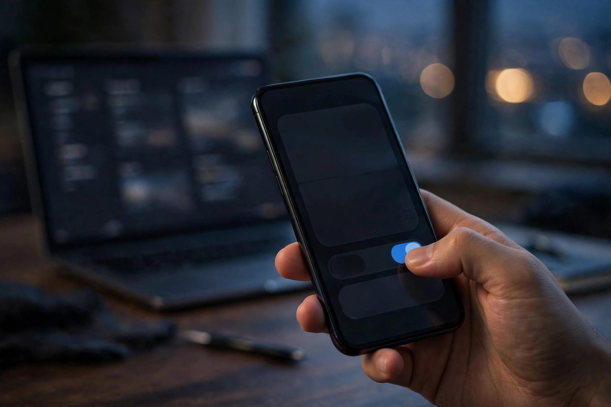
The best answer for many sites is refusing to choose: implement a theme toggle and default to the visitor's system preference. Modern browsers expose whether a user prefers dark or light mode, and respecting that preference is both user-friendly and impressive. A manual toggle in the header gives visitors control, which itself builds goodwill.
This approach takes more design work — every color, image treatment, and shadow needs a dark and light variant — but it sidesteps the debate entirely. Start with CSS variables for all theme colors from day one; it makes adding the second theme dramatically easier later. If a toggle is beyond your budget, default to light mode for traditional businesses and consider dark mode only when your brand genuinely suits it. Either way, pair your choice with strong color fundamentals and readable typography.
Dark Mode vs Light Mode: Quick Decision Framework
- →Choose light mode if: you are a traditional service business, your pages are text-heavy, or your audience skews older or conservative.
- →Choose dark mode if: you are a creative/tech/entertainment brand, your site is visual-first, or your audience skews young and tech-savvy.
- →Offer both if: you have the budget, your audience is mixed, or you want the premium touch of a theme toggle.
- →Either way: test on real phones in real mobile conditions — brightness, sunlight, and small screens change everything.
Frequently Asked Questions
Does dark mode improve battery life?
On OLED screens, yes — dark pixels use less power. On LCD screens, the difference is negligible. It is a nice bonus, not a reason to choose dark mode.
Is dark mode better for accessibility?
Not automatically. Some users with astigmatism actually read light text on dark backgrounds worse. What matters for accessibility is contrast ratio and text size, in either mode.
Can I switch my existing site to dark mode easily?
It requires restyling every component — colors, images, shadows, and form elements. Using CSS variables from the start makes it far easier; retrofitting takes real design work.
Do customers care which mode a business website uses?
Mostly they care that it looks professional and is easy to read. Mode is secondary to execution — a polished site in either mode beats a sloppy one in the "right" mode.
Dark mode vs light mode is not a battle with a winner — it is a design decision that should follow your brand, your audience, and your content. Choose deliberately, execute carefully, and when in doubt, let the visitor decide with a toggle. If you want help implementing a polished dual-theme design, a professional consultation can scope it for your site.

Muhammad Usman designs and builds high-converting websites for small businesses — and writes practical guides like this one from real project experience.
Keep Reading

How to Make Your Website Look Trustworthy Instantly
White Space in Web Design: Why Less Is More

How to Design a Website That Looks Expensive on a Budget
Need a Website That Actually Performs?
Fixed pricing, professional build, live in weeks. Tell us about your project — free strategy call, no pressure.