Website Typography: Fonts That Build Trust
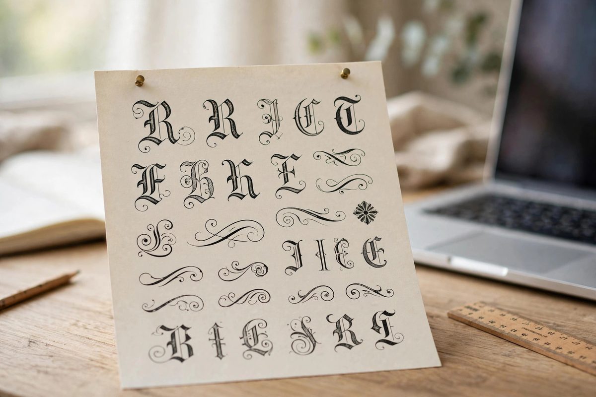
Imagine two accounting firms. One uses a clean, confident typeface with generous spacing; the other uses a playful rounded font with text crammed edge to edge. Before reading a word, you already trust the first one more. That is the power of website typography. Fonts are the voice of your website — they set the tone, signal professionalism, and determine whether people actually read what you wrote. Here is how to choose type that builds trust instead of undermining it.
Why Website Typography Changes How People Feel About You
Typography works on visitors the way tone of voice works in conversation. A sturdy serif like Georgia feels established and traditional — natural for law firms, financial advisors, and heritage brands. A clean sans-serif like Inter or Open Sans feels modern and straightforward — the default choice for tech companies, agencies, and most service businesses. A script or decorative font feels personal and creative, but used in the wrong place it can look unprofessional.
The key insight is consistency between your font and your promise. A luxury brand using a cartoonish font creates a mismatch that visitors feel as unease, even if they cannot name it. Your typography should sound like the business you actually are.
The Two-Font Rule
One of the fastest ways to make a website look amateurish is using too many fonts. Stick to two: one for headings and one for body text. A classic, reliable pairing is a distinctive font for headlines — something with a bit of character — combined with a highly readable workhorse for paragraphs.
If the pairing feels tricky, there is a safe shortcut: use one font family in different weights. A bold weight for headings and a regular weight for body text, from the same family, always looks cohesive. Many of the best small business websites do exactly this and look thoroughly professional. Pair your choices with a considered color scheme and the whole page will feel designed rather than assembled.
Size and Spacing Matter More Than the Font Itself
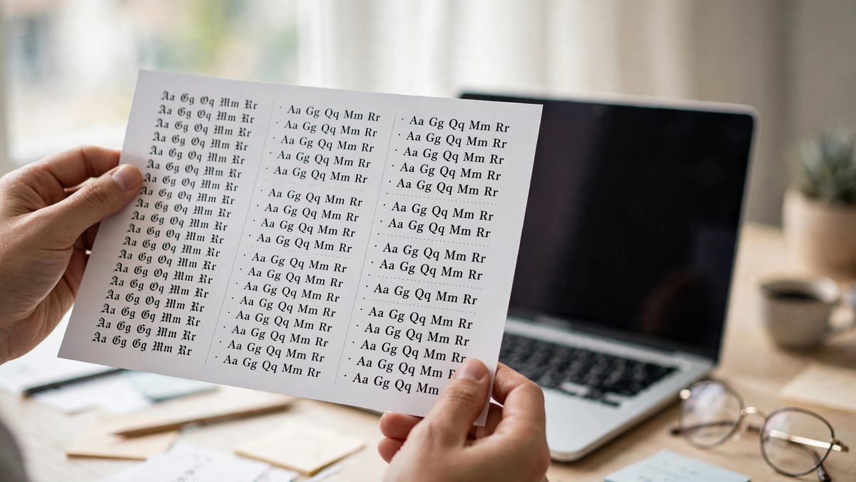
Here is a secret most font guides skip: how you set the type matters more than which typeface you pick. Body text should be at least 16 pixels — smaller text strains eyes and drives mobile visitors away. Line height (the space between lines) should be generous, around 1.5 to 1.7 times the font size, so paragraphs breathe instead of suffocating.
Headings need clear hierarchy: your main headline largest, section headings noticeably smaller, and body text smallest. When every heading is roughly the same size, visitors cannot tell what matters most. And keep line lengths in check — around 60 to 75 characters per line is the sweet spot for comfortable reading. This is where white space does its quiet work: spacing is typography too.
Avoid These Typography Mistakes
- →Thin, lightweight fonts for body text — they look elegant but are hard to read, especially on phones.
- →All-caps paragraphs — fine for a short label, exhausting for sentences.
- →Centered body text — it looks tidy but makes long passages difficult to read; left-align paragraphs.
- →Low-contrast gray text — light gray on white may look refined, but many visitors literally cannot read it.
- →More than two font families — it fragments your brand and looks chaotic.
Free Fonts That Look Professional
You do not need to buy expensive fonts. Google Fonts offers a huge library of free, high-quality typefaces that work beautifully on business websites. Some dependable choices: Inter and Open Sans for clean, modern body text; Lora or Merriweather for trustworthy serif headings; Poppins or Montserrat for bold, friendly headlines.
Whatever you choose, load only the weights you actually use — each extra weight slows your page slightly. Two weights (regular and bold, for example) are usually plenty for a small business site. And remember that good type supports content that ranks: readable pages keep visitors longer, which search engines notice.
Test on a Real Phone
Typography that looks perfect on a large desktop monitor can fall apart on a phone. Always check your site on an actual mobile device: is the body text comfortably readable without zooming? Do headings wrap awkwardly? Does any text overlap images or buttons at small sizes?
Pay special attention to your headlines on mobile — long headlines that looked powerful on desktop can become an intimidating wall of stacked words on a phone. Slightly shorter headlines, or responsive sizes that shrink gracefully, keep the mobile experience clean.
Frequently Asked Questions
How many fonts should a website use?
Two at most: one for headings, one for body text. Using a single family in different weights is an even safer option that always looks cohesive.
What is the best font size for website body text?
At least 16 pixels, with line height of 1.5 to 1.7. Smaller text strains readers and drives mobile visitors away.
Are Google Fonts free for business websites?
Yes, all Google Fonts are free for commercial use, including on business websites. They are also optimized for fast web loading.
Serif or sans-serif for a business website?
Sans-serif is the safer default for most modern businesses — clean and readable on screens. Serif suits traditional, luxury, or editorial brands. Match the font to the feeling your customers should get.
Typography is one of those invisible crafts: when it is done well, nobody notices the fonts — they just feel that your business is credible and your content is worth reading. Get the fundamentals right — two fonts, generous sizing, strong contrast, comfortable spacing — and your words will do the selling. If your site's type feels off but you cannot pinpoint why, a professional design review can diagnose it quickly.

Muhammad Usman designs and builds high-converting websites for small businesses — and writes practical guides like this one from real project experience.
Keep Reading

Above the Fold: What to Put at the Top of Your Homepage
How to Choose Colors for Your Business Website

How Many Pages Should a Small Business Website Have?
Need a Website That Actually Performs?
Fixed pricing, professional build, live in weeks. Tell us about your project — free strategy call, no pressure.