How to Choose Colors for Your Business Website
Visitors form an opinion about your website within seconds, and color does a surprising amount of that talking. Before anyone reads a word, your color scheme has already suggested whether you are bold or cautious, premium or budget-friendly, traditional or modern. Choosing business website colors is not just a decoration decision — it is a business decision. This guide walks you through picking a palette that feels right for your industry and actually helps turn visitors into customers.
Start With What Colors Mean
Colors carry associations that most people absorb without thinking. Blue suggests trust and reliability, which is why banks, healthcare providers, and tech companies use it so heavily. Red creates urgency and appetite — think clearance sales and restaurants. Green signals growth, health, and money. Orange feels friendly and energetic, while black and gold suggest luxury and premium pricing.
These associations are not rigid rules, but they are useful starting points. A law firm in neon pink will confuse people; a children's party business in dark gray will feel wrong. Ask yourself what feeling a customer should have in the first three seconds — calm confidence, excitement, warmth, luxury — and let that feeling narrow your options.
Look at Your Industry First
Every industry has color conventions, and there is a smart reason to respect them: they match what your customers already expect. A plumber's website in navy and orange feels instantly credible because dozens of successful trade businesses use that combination. A spa in soft sage green and cream immediately promises relaxation.
That does not mean you must copy your competitors exactly. Study three to five successful businesses in your field, note the patterns, then choose a variation that stands out slightly — a deeper shade, a fresher accent, a cleaner background. Familiar enough to feel right, different enough to be remembered.

The 60-30-10 Rule
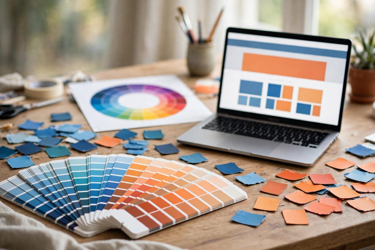
Professional designers rarely use more than three colors, and they distribute them with a simple formula: 60 percent dominant color, 30 percent secondary color, 10 percent accent. On most business websites, the 60 percent is a neutral background — white, off-white, or a very light gray — because text must stay readable above all else.
The 30 percent is your brand color, used for headings, navigation, and section backgrounds. The final 10 percent is your accent — the color reserved for the things you most want people to notice and click: call-to-action buttons, important links, and key highlights. When everything screams, nothing gets heard. When only the important things use the accent color, visitors instinctively know where to look.
Make Your Buttons Impossible to Miss
Your call-to-action buttons deserve special attention in your color plan. The highest-converting button colors are the ones that contrast sharply with the rest of the page. If your site is mostly blue and white, an orange or green button will practically jump off the screen — which is exactly what you want.
Pick one button color and use it consistently for your primary action everywhere on the site. Use a quieter, secondary style for less important actions like "Learn More." And always check contrast: white text on a light button, or dark text on a pale button, will be unreadable. Color and typography work together here — both must serve readability first.
Test Readability Above Everything
The most common color mistake small businesses make is sacrificing readability for style — light gray text on a white background, or white text over a busy photo. It might look elegant in a design mockup, but real visitors, especially older ones or those on phones in bright sunlight, will simply leave rather than squint.
Body text should be dark on light, or light on dark, with strong contrast. If you place text over an image, add a dark overlay behind the text to guarantee legibility — our guide on picking website images covers this technique. When in doubt, choose the more readable option. A website that is easy to read will always outperform a prettier one that strains the eyes.
How to Choose Business Website Colors: A Simple Process
- →Write down three words describing how customers should feel: for example, "trusted, calm, professional."
- →Pick one primary brand color that matches that feeling and your industry norms.
- →Choose a neutral background (white or off-white) and a dark text color with strong contrast.
- →Select one high-contrast accent color reserved for buttons and key actions.
- →Apply the 60-30-10 rule across a test page, then check it on a phone in daylight.
- →Show it to three people outside your business and ask what feeling they get in five seconds.
Remember that restraint in color pairs naturally with generosity in spacing — see why white space matters for the other half of a premium look.
Frequently Asked Questions
How many colors should a business website use?
Three at most: a neutral background, one brand color, and one accent color for calls to action. More than that looks chaotic and dilutes your brand.
What is the best color for call-to-action buttons?
Whatever contrasts most with your page. Orange and green perform well on blue/white sites; the key is contrast and consistency, not a magic color.
Should my website colors match my logo?
Yes, your primary brand color should come from or complement your logo. Consistency between logo, website, and marketing materials builds recognition.
Do website colors really affect sales?
They affect trust, readability, and whether visitors notice your call to action — all of which directly influence conversions. Color will not fix a bad offer, but poor color choices can sink a good one.
Good color choices will not rescue a bad offer, but bad color choices can absolutely sink a good one. Keep your palette tight, your contrast strong, and your buttons unmissable — and your website will start working as hard as you do. If you want help refining your brand colors, a professional design consultation can get your palette right the first time.

Muhammad Usman designs and builds high-converting websites for small businesses — and writes practical guides like this one from real project experience.
Keep Reading
Website Typography: Fonts That Build Trust

7 Website Design Mistakes That Kill Conversions

Above the Fold: What to Put at the Top of Your Homepage
Need a Website That Actually Performs?
Fixed pricing, professional build, live in weeks. Tell us about your project — free strategy call, no pressure.