How to Improve Your Website's User Experience: 9 Fixes That Actually Work

Most small business websites don't have a traffic problem. They have a patience problem. Visitors arrive, look around for a few seconds, can't quite work out what to do next, and leave. Usability Geek's founder Justin Mifsud reports that 88% of online customers avoid returning to a website after one bad experience, which means a clumsy site loses that visitor for good. The good news: most UX problems are friction problems, and the fixes below cost little or nothing.
- What "Good UX" Actually Means
- 1. Fix the Wait First
- 2. Say What You Do in Five Seconds
- 3. Cut the Menu Down to What Customers Want
- 4. Give Every Page One Job
- 5. Design for the Phone First
- 6. Shorten Your Forms
- 7. Write for Scanners, Not Readers
- 8. Make Contact Effortless
- 9. Test With Real People, One Change at a Time
- When Quick Fixes Aren't Enough
What "Good UX" Actually Means
User experience is just a fancy way of saying: how easy does your site feel to use? Not how pretty it looks, but how quickly a stranger can work out what you do, find what they need, and do the thing they came to do. A beautiful site that's hard to use will lose to a plain site that's easy to use, every single time. UX and UI aren't the same thing, and the difference matters: UI is how the site looks, UX is how it works. Our UX vs UI guide explains the split in plain terms, but the short version is this: your visitors don't care about either word. They care whether your site wastes their time.
1. Fix the Wait First
Nothing else matters if the page won't load. Google's research with Ipsos found that 53% of mobile users will leave a site if it takes more than 3 seconds to load, and Unbounce reports that 70% of consumers dislike buying from a website that loads slowly. Before you spend a dollar on a new look, run your homepage through Google PageSpeed Insights and look at what's actually slow. In our experience, it's almost always the same three things: oversized images, plugins the site no longer needs, and cheap shared hosting. Compress the images, remove the dead weight, and re-test. A site that loads in under two seconds feels like a different business to visit. Our website speed guide has the full step-by-step version.
2. Say What You Do in Five Seconds
Here's a test that costs nothing and hurts a little: show your homepage to someone who knows nothing about your business, take it away after five seconds, and ask them what you sell. If they can't answer, your headline isn't doing its job. Most small business homepages open with something like "Welcome to our website" or a vague line about "quality solutions", words that tell a visitor nothing and give Google nothing either. A working headline says three things: what you do, who it's for, and what happens next. "Family dentistry in Islamabad: book your check-up today" does all three in one line. "Welcome to our website" does none of them. This is the single cheapest fix on this list.
3. Cut the Menu Down to What Customers Want
Open your menu and count. If it's pushing past seven items, your visitors are doing more work than they should. And look at the labels: most small business menus mirror the company's internal structure: "Solutions", "Sectors", "Insights", "Resources", instead of what a customer is actually trying to do. A visitor wants to know what you offer, whether you're credible, what it costs, and how to reach you. Build the menu around that: Services, Work, About, FAQs, Contact. Use words your customers use. "Services" beats "Our Solutions" because nobody searches for solutions. They search for the service. Drop the dropdowns that bury your best pages. If a page matters, it should be one click from the homepage.
4. Give Every Page One Job
Every page on your site exists to get the visitor to do one thing. A service page exists to get a quote request. A product page exists to get a sale. A booking page exists to get a booking. So give each page one clear action and make it the loudest thing on the page: one button that stands out, in one place, with plain words on it: "Get a quote", "Book a call", "Shop now". The mistake we see constantly is five buttons given equal weight, all shouting at once. When everything is the priority, nothing is, and the visitor picks none of them. The fix is deciding what the page is for, then deleting the competing actions. Repeat the same button further down long pages.
5. Design for the Phone First
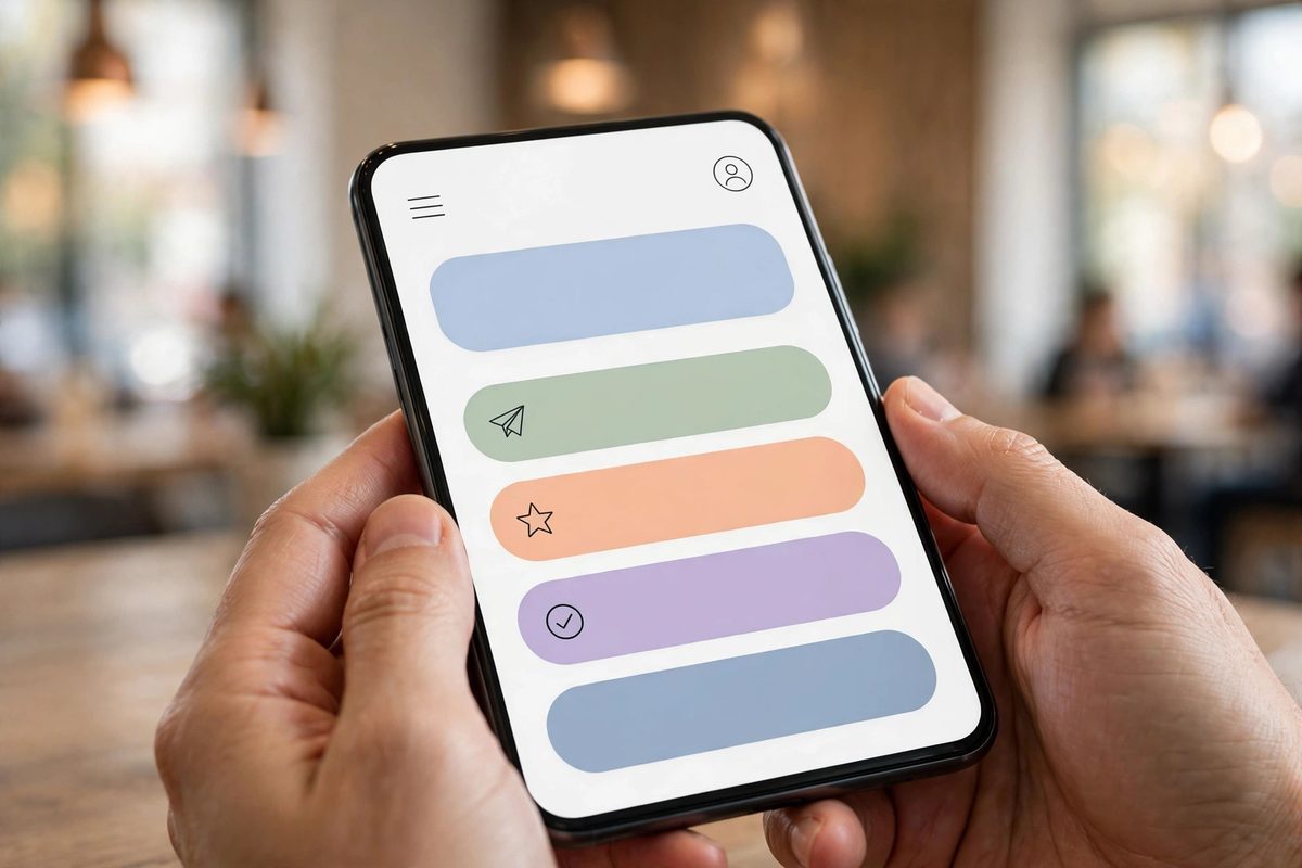
More than half of all website traffic now comes from phones. Statista put mobile at 58% of global website traffic in the first quarter of 2023, and Baymard's research found users are five times more likely to abandon a task on a site that isn't optimized for mobile. Yet most small business sites are still designed on a desktop and checked on a phone as an afterthought. Flip that order: open your site on your own phone, on a mobile connection, and try to do the one thing a customer would do. Can you tap every button with your thumb? Is the text readable without zooming? Does the form fit the screen? A good rule of thumb is buttons at least 44 pixels tall and body text no smaller than 16 pixels. Test the fiddly parts too: date pickers, dropdowns, payment fields.
6. Shorten Your Forms
Every field on a form is a reason to quit. A quote request that asks for a name, a phone number, and a short message gets filled in. The same request that also asks for a company name, a budget range, a preferred date, a referral source, and a second phone number gets abandoned halfway through, usually at the field the visitor doesn't want to answer. Only ask for what you need to reply. Keep the fields you do ask easy to use: labels above each box, error messages that say what's actually wrong, and a submit button that says what happens next. "Send my request" beats "Submit" because it tells the visitor what they're agreeing to.
7. Write for Scanners, Not Readers
Nobody reads a website the way they read a book. People scan. They read the headings, the first line of each paragraph, and the bold bits, and they decide in seconds whether the page is worth their time. So write for that behaviour instead of fighting it. Keep paragraphs short. Put a benefit in every heading instead of a topic ("Get a quote in under 2 minutes" beats "Our process"). Lead with the outcome, then the detail, then the background. Journalists call this the inverted pyramid, and it works because the most important information comes first. "We deliver bespoke integrated solutions" tells a visitor nothing; "WordPress websites for small businesses that need more enquiries" tells them everything. The usability expert Steve Krug summed the whole discipline up in four words: "Don't make me think."
8. Make Contact Effortless
This one sounds too obvious to list, and that's exactly why it's still broken on so many sites. Your phone number should be in the header of every page, tap-to-call on mobile, and in the footer too. Your contact page should be one click from anywhere, not buried under a dropdown. A visitor who has to hunt for a phone number won't hunt for long. They'll call the competitor whose number is in the header.
9. Test With Real People, One Change at a Time
Here's the uncomfortable truth about everything above: you can't tell from your desk whether it worked. The only way to know is to watch someone use the site. You don't need a lab or a budget. Ask three people who aren't involved in the business to do one realistic task: "find the price of a cleaning service and request a quote", "find a product and reach the delivery options". Don't help. Just watch where they pause, backtrack, or give up. Three people stumbling in the same place matters more than one person's opinion, including yours. Then change one thing at a time. Change three things at once and you'll never know which one did the work. And you'll never know what to do next. If you want a yardstick for the numbers, our guide to good conversion rates shows what small business sites should realistically aim for.
When Quick Fixes Aren't Enough
Most of the fixes above take an afternoon, and for a lot of sites they're genuinely enough. But sometimes the problem runs deeper than a headline or a form. A bloated theme that loads slowly no matter what you compress, a checkout that was built wrong from the start, pages structured so badly that no amount of rewriting helps: those are structural problems, and no list of quick wins will fix them. That's the point where a proper rebuild pays for itself. If you've worked through this list and the site still feels hard to use, the problem is probably structural, and that's the point where outside help pays for itself.
Start with the top of the list: speed, headline, menu. UX isn't a one-time project; it's the habit of removing friction every time you find it. The sites that win aren't the prettiest ones. They're the ones that make it easiest for a stranger to become a customer. If you'd like a second pair of eyes on yours, get in touch with us and tell us where visitors seem to drop off, and we'll tell you honestly whether it's a quick fix or something bigger.
Frequently Asked Questions
What is website user experience (UX)?
Website user experience is how easy and pleasant your site feels to use, and how quickly a visitor can work out what you do, find what they need, and complete the task they came for. It's different from UI (user interface), which is how the site looks. A site can look great and still have bad UX if visitors can't find anything or the checkout keeps tripping them up.
How can I improve my website's UX without a redesign?
Start with the cheap wins: compress your images so pages load faster, rewrite the homepage headline so it says what you do and who it's for, cut the menu to five or seven items, give every page one clear call to action, and shorten your forms to the fields you actually need. Most of these take an afternoon and cost nothing.
How long does it take to improve website UX?
Quick fixes like a headline rewrite, menu cleanup, or image compression can be done in a day. Deeper work, like restructuring pages, rebuilding a slow theme, or fixing a checkout, takes longer. The honest answer is that UX is never finished: you fix the biggest friction, measure the result, and move on to the next one.
How do I know if my website has bad UX?
A high bounce rate on key pages, forms that get started but rarely submitted, and a site that feels clumsy on your own phone. The fastest check is to watch three people who don't know your business try to complete one task on the site, and where they hesitate is where your UX is failing.

Muhammad Usman designs and builds high-converting websites for small businesses — and writes practical guides like this one from real project experience.
Keep Reading

What Makes a Good Website? 8 Traits Every Great Site Shares

Website Speed: How Loading Time Quietly Decides Your Sales and Google Rankings

UX vs UI Design: What's the Difference? (And Why Your Website Needs Both)
Need a Website That Actually Performs?
Fixed pricing, professional build, live in weeks. Tell us about your project — free strategy call, no pressure.