Why Mobile-Responsive Design Is Non-Negotiable in 2026
Here is a sentence that should end all debate: more than 60% of your website visitors are on a phone. If your site is hard to use on mobile, you are not losing "some" customers — you are losing most of them. Yet businesses still launch desktop-first sites in 2026. This guide explains what responsive design actually means, how to check yours, and what it costs to fix.
What "Responsive" Actually Means
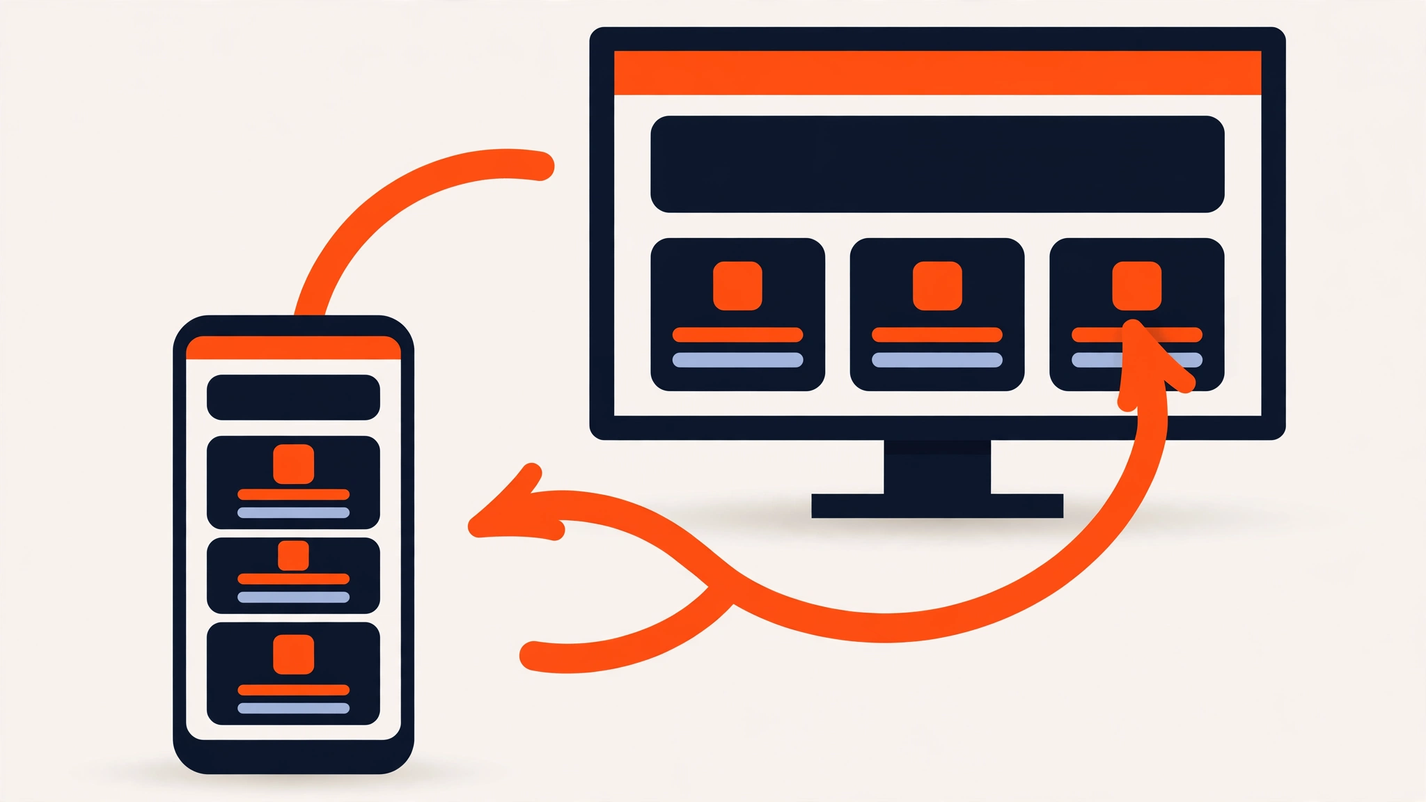
Responsive design is not a separate "mobile version" of your site. It is one website that fluidly adapts: layouts reflow, text stays readable without zooming, buttons grow to thumb-size, navigation collapses into a menu, and images scale without breaking. One codebase, every screen — phones, tablets, laptops, desktops.
The outdated alternative — a separate mobile site (like m.yoursite.com) — creates duplicate content headaches and double maintenance. Nobody should be selling you that in 2026.
Three Reasons It Is Non-Negotiable
1. Google ranks mobile-first
Google predominantly uses the mobile version of your site for indexing and ranking. A site that breaks on phones does not just annoy visitors — it directly harms your search positions. Our local SEO guide covers this among the ranking fundamentals.
2. Mobile users convert differently
Phone visitors are often closer to a buying decision — searching "near me," comparing options, ready to call. But they are also less patient: tiny tap targets, horizontal scrolling, or a form that needs pinching to fill will send them to a competitor in seconds. Every extra friction point on mobile costs disproportionately more than on desktop.
3. It is a trust signal
A site that looks broken on a phone reads as a business that does not care about details. In competitive local markets, the polished mobile experience is often the tiebreaker between you and the next listing.
How to Test Your Current Site (5 Minutes)
- 1.Open your site on your own phone — not just shrinking a desktop browser. Browse like a customer.
- 2.Can you read all text without zooming? Any horizontal scrolling means something is broken.
- 3.Tap every button and menu link with your thumb. Missed taps mean targets are too small.
- 4.Fill out your contact/quote form completely on the phone. Forms are where mobile sites most often fail.
- 5.Run Google's Mobile-Friendly Test and PageSpeed Insights on your URL — fix what they flag, starting with speed issues.
Red flag: if any agency lists "mobile-responsive version" as a paid add-on, walk away. Responsiveness has been a baseline professional requirement for over a decade — it is point #3 on our agency checklist for a reason.
Common Mobile Mistakes We Still See
- ✕Text over images that becomes unreadable when the image crops on narrow screens.
- ✕Popups that cover the whole phone screen with a tiny close button — Google penalizes intrusive interstitials.
- ✕Desktop-sized tap targets — buttons and links need at least ~44px touch areas.
- ✕Huge uncompressed images that take forever on mobile data — the top cause of slow mobile loads.
- ✕Hiding content on mobile instead of reflowing it — if it matters, it should be reachable on phones too.
The Bottom Line
Responsive design is not a feature — it is the foundation everything else stands on. Every site we build, from the $499 one-pager upward, is designed mobile-first and tested on real phones before launch.
Not sure yours holds up? Send us your URL — we will run the mobile checks and tell you honestly what needs fixing, free.

We design and build high-converting websites for small businesses — fixed pricing, honest advice, and practical guides like this one.
Keep Reading

Website Speed: How Loading Time Quietly Decides Your Sales and Google Rankings

Local SEO Basics: How Small Businesses Get Found on Google

How to Write Website Content That Actually Converts Visitors into Customers
Need a Website That Actually Performs?
Fixed pricing, professional build, live in weeks. Tell us about your project — free strategy call, no pressure.